Showing posts with label Menu. Show all posts

Friday, September 15, 2017

Pure CSS3 Multi Level Drop Down Menu For Blogger V1


I recently posted Add Smooth Multi Level Drop-Down Menu In Blogger. But this is simple, smooth not just a perfect good looking Stylish Pure CSS3 Multi Level Drop Down Menu. Now I comes with Stylish Pure CSS3 Multi Level Drop Down Menu For Blogger. This menu is purely designed with CSS3 and No Images, No javascript is included in it. It is compatible for almost all browsers like Mozilla Firefox and Google Chrome etc but the rounded corners and shadow will not be rendered properly. This menu is provided by webDesignerWall. I have made installation method very easy you just need to copy and paste the code to where you want Multi Level Drop Down Menu to appear.

Pure CSS3 Multi Level Drop Down Menu Preview Live Demo

Add Multi Level Drop Down Menu To Blogger

  1. Go To Blogger > Design
  2. Click on “Add a Gadget”
  3. Choose HTML/Javascript widget
  4. Paste the following code inside it
<style>
#ABT-Container {
font: normal .8em/1.5em Arial, Helvetica, sans-serif;
background: #ebebeb;
width:100%; float:left;
}

a {
color: #333;
}
#nav {
margin: 0;
padding: 7px 6px 0;
line-height: 100%;
border-radius: 2em;

-webkit-border-radius: 2em;
-moz-border-radius: 2em;

-webkit-box-shadow: 0 1px 3px rgba(0, 0, 0, .4);
-moz-box-shadow: 0 1px 3px rgba(0, 0, 0, .4);

background: #8b8b8b; /* for non-css3 browsers */
filter: progid:DXImageTransform.Microsoft.gradient(startColorstr='#a9a9a9', endColorstr='#7a7a7a'); /* for IE */
background: -webkit-gradient(linear, left top, left bottom, from(#a9a9a9), to(#7a7a7a)); /* for webkit browsers */
background: -moz-linear-gradient(top, #a9a9a9, #7a7a7a); /* for firefox 3.6+ */

border: solid 1px #6d6d6d;
}
#nav li {
margin: 0 5px;
padding: 0 0 8px;
float: left;
position: relative;
list-style: none;
}
/* main level link */
#nav a {
font-weight: bold;
color: #e7e5e5;
text-decoration: none;
display: block;
padding: 8px 20px;
margin: 0;
-webkit-border-radius: 1.6em;
-moz-border-radius: 1.6em;
text-shadow: 0 1px 1px rgba(0, 0, 0, .3);
}
/* main level link hover */
#nav .current a, #nav li:hover > a {
background: #d1d1d1; /* for non-css3 browsers */
filter: progid:DXImageTransform.Microsoft.gradient(startColorstr='#ebebeb', endColorstr='#a1a1a1'); /* for IE */
background: -webkit-gradient(linear, left top, left bottom, from(#ebebeb), to(#a1a1a1)); /* for webkit browsers */
background: -moz-linear-gradient(top, #ebebeb, #a1a1a1); /* for firefox 3.6+ */

color: #444;
border-top: solid 1px #f8f8f8;
-webkit-box-shadow: 0 1px 1px rgba(0, 0, 0, .2);
-moz-box-shadow: 0 1px 1px rgba(0, 0, 0, .2);
box-shadow: 0 1px 1px rgba(0, 0, 0, .2);
text-shadow: 0 1px 0 rgba(255, 255, 255, .8);
}
/* sub levels link hover */
#nav ul li:hover a, #nav li:hover li a {
background: none;
border: none;
color: #666;
-webkit-box-shadow: none;
-moz-box-shadow: none;
}
#nav ul a:hover {
background: #0399d4 !important; /* for non-css3 browsers */
filter: progid:DXImageTransform.Microsoft.gradient(startColorstr='#04acec', endColorstr='#0186ba'); /* for IE */
background: -webkit-gradient(linear, left top, left bottom, from(#04acec), to(#0186ba)) !important; /* for webkit browsers */
background: -moz-linear-gradient(top, #04acec, #0186ba) !important; /* for firefox 3.6+ */

color: #fff !important;
-webkit-border-radius: 0;
-moz-border-radius: 0;
text-shadow: 0 1px 1px rgba(0, 0, 0, .1);
}
/* level 2 list */
#nav ul {
background: #ddd; /* for non-css3 browsers */
filter: progid:DXImageTransform.Microsoft.gradient(startColorstr='#ffffff', endColorstr='#cfcfcf'); /* for IE */
background: -webkit-gradient(linear, left top, left bottom, from(#fff), to(#cfcfcf)); /* for webkit browsers */
background: -moz-linear-gradient(top, #fff, #cfcfcf); /* for firefox 3.6+ */

display: none;
margin: 0;
padding: 0;
width: 185px;
position: absolute;
top: 35px;
left: 0;
border: solid 1px #b4b4b4;
-webkit-border-radius: 10px;
-moz-border-radius: 10px;
border-radius: 10px;
-webkit-box-shadow: 0 1px 3px rgba(0, 0, 0, .3);
-moz-box-shadow: 0 1px 3px rgba(0, 0, 0, .3);
box-shadow: 0 1px 3px rgba(0, 0, 0, .3);
}
/* dropdown */
#nav li:hover > ul {
display: block;
}
#nav ul li {
float: none;
margin: 0;
padding: 0;
}
#nav ul a {
font-weight: normal;
text-shadow: 0 1px 1px rgba(255, 255, 255, .9);
}
/* level 3+ list */
#nav ul ul {
left: 181px;
top: -3px;
}
/* rounded corners for first and last child */
#nav ul li:first-child > a {
-webkit-border-top-left-radius: 9px;
-moz-border-radius-topleft: 9px;
-webkit-border-top-right-radius: 9px;
-moz-border-radius-topright: 9px;
}
#nav ul li:last-child > a {
-webkit-border-bottom-left-radius: 9px;
-moz-border-radius-bottomleft: 9px;
-webkit-border-bottom-right-radius: 9px;
-moz-border-radius-bottomright: 9px;
}
/* clearfix */
#nav:after {
content: ".";
display: block;
clear: both;
visibility: hidden;
line-height: 0;
height: 0;
}
#nav {
display: inline-block;
}
html[xmlns] #nav {
display: block;
}
* html #nav {
height: 1%;
}
</style>

<div id="ABT-Container">
<ul id="nav"><li><a href="#">Home</a></li>
<li><a href="#">Technology Tricks</a>
<ul>
<li><a href="#">Sub-Row</a>
<ul>
<li><a href="#">Sub Sub-Row 1</a></li>
</a></li></ul>
</li>
<li><a href="#">Sub-Row</a>
<ul>

<li><a href="#">Sub Sub-Row 2</a></li>
</ul>
</li>
<li><a href="#">Sub-Row</a></li>
</ul>
</li>

<li><a href="#">Multi-Levels</a>
<ul>
<li><a href="#">Team</a>
<ul>
<li><a href="#">Sub-Level Item 1</a></li>
<li><a href="#">Sub-Level Item 1</a>
<ul>
<li><a href="#">Sub-Level Item 11</a></li>
<li><a href="#">Sub-Level Item 22</a></li>
<li><a href="#">Sub-Level Item 33</a></li>
</ul>
</li>

<li><a href="#">Sub-Level Item 1</a></li>
</ul>
</li>
<li><a href="#">Sales</a></li>
<li><a href="#">Another Link</a></li>
<li><a href="#">Department</a>
<ul>
<li><a href="#">Sub-Level Item 2</a></li>
</ul>
</li>
</ul>
</li><li><a href="#">Home</a></li>
<li><a href="#">About Me</a></li>
<li><a href="#">Contact Me</a></li>
<li><a href="#">Blogger Tutorials</a></li>


</ul>
</div>

 Now kindly make these customization changes to add your own links to menu:
  • Each TAB can be edited by directly understanding the following  HTML code,
<li><a href=”#“>TAB TEXT</a></li>
In each case replace the hash sign (#) with your page URL or link and replace the text with your page title. I have kept the page titles unchanged in the code above so that you could easily edit them by seeing the demo.
This is V1 of Multi Level Drop Down Menu. I will soon publish another article on this cool Multi Level Drop Down Menu. Till than stay tune!

Extra Help

The image below shows how the menu will look if CSS3 is not supported.


One Gradient Image is Used

A white-transparent image is used to achieve the gradient effect. Because the new CSS3 gradient feature is not supported by all browsers yet, it is safer to use a gradient background image.

The instensitiy of the gradient can be changed by shifting the background image up or down. Also, the gradient color can be easily adjusted by changing the background color.
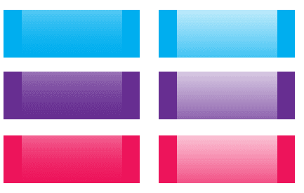
The best part about this Multi Level Drop Down Menu is that you can give it any colour you want because here we are using a transparent gradient image which can take any colour you want. Like:
CSS Code

I’m not going to explain the CSS line by line. The images below explain the key points on how this dropdown is coded.


Resource

Stylish Pure CSS3 Multi Level Drop Down Menu For Blogger V2

I recently posts Pure CSS3 Multi Level Drop Down Menu For Blogger V1. I gets good response for this so I decided to release Pure CSS3 Multi Level Drop Down Menu V1. This Multi Level Drop Down Menu is modifed version of previous css3 menu. I had added some cool features to this menu. This menu is a Stylish Pure CSS3 Multi Level Drop Down Menu For Blogger. It is compatible for almost all browsers like Mozilla Firefox and Google Chrome etc but the rounded corners and shadow will not be rendered properly. I had made installation so easy you just need to copy and paste menu code in your blogger blog widget. This Menu  is provided by webDesignerWall guys and it is widgetized and made compatible with Blogspot blog platform by MBT.


See Also

Pure CSS3 Multi Level Drop Down Menu V2 Preview Live Demo

Add Pure CSS3 Multi Level Drop Down Menu V2 To Blogger

  1. Go To Blogger > Design
  2. Click on “Add a Gadget”
  3. Choose HTML/Javascript widget
  4. Paste the following code inside it

<style>
#ABT-Container {
font: normal 1em Arial, Helvetica, sans-serif;
background : #ddd; width:100%; float:left;
}
a {
color: #333;
}.example {
background:#fff url(http://www.gowebbaby.com/wp-content/uploads/2011/12/website-designer.gif)center right no-repeat;
width:1200px;
height:600px;
border:1px #000 solid;
margin:20px auto;
padding:15px;
border-radius:3px;
-moz-border-radius:3px;
-webkit-border-radius:3px;
}

#nav {
margin: 0;
padding: 7px 6px 0;
background: #0080ff url(https://blogger.googleusercontent.com/img/b/R29vZ2xl/AVvXsEg2Bp-eJyTufYqTxyXFAA7oFdF84X37DdJzKA7cFdCx-9M8pbjx1Vvh1JfTPGo35OIb6a4-8GhoTklWqlxebIMVye3OPAVRvdAy99i2hU0SrKcO6ki8fzY_oIGq1ZqJJoaq7leHxXnoleg/s1600/gradient.png) repeat-x 0 -110px;
line-height: 100%;
border-radius: 2em;
-webkit-border-radius: 2em;
-moz-border-radius: 2em;
-webkit-box-shadow: 0 1px 3px rgba(0,0,0, .4);
-moz-box-shadow: 0 1px 3px rgba(0,0,0, .4);
}
#nav li {
margin: 0 5px;
padding: 0 0 8px;
float: left;
position: relative;
list-style: none; }

/* main level link */
#nav a {
font-weight: bold;
color: #e7e5e5;
text-decoration: none;
display: block;
padding: 8px 20px;
margin: 0;
-webkit-border-radius: 1.6em;
-moz-border-radius: 1.6em;

text-shadow: 0 1px 1px rgba(0,0,0, .3);
}
#nav a:hover {
background: #000;
color: #fff;
}
/* main level link hover */
#nav .current a, #nav li:hover > a {
background: #666 url(https://blogger.googleusercontent.com/img/b/R29vZ2xl/AVvXsEg2Bp-eJyTufYqTxyXFAA7oFdF84X37DdJzKA7cFdCx-9M8pbjx1Vvh1JfTPGo35OIb6a4-8GhoTklWqlxebIMVye3OPAVRvdAy99i2hU0SrKcO6ki8fzY_oIGq1ZqJJoaq7leHxXnoleg/s1600/gradient.png) repeat-x 0 -40px;
color: #444;
border-top: solid 1px #f8f8f8;
-webkit-box-shadow: 0 1px 1px rgba(0,0,0, .2);
-moz-box-shadow: 0 1px 1px rgba(0,0,0, .2);
box-shadow: 0 1px 1px rgba(0,0,0, .2);
text-shadow: 0 1px 0 rgba(255,255,255, 1);
}
/* sub levels link hover */
#nav ul li:hover a, #nav li:hover li a {
background: none;
border: none;
color: #666;
-webkit-box-shadow: none;
-moz-box-shadow: none;
}
#nav ul a:hover {
background: #0080ff url(https://blogger.googleusercontent.com/img/b/R29vZ2xl/AVvXsEg2Bp-eJyTufYqTxyXFAA7oFdF84X37DdJzKA7cFdCx-9M8pbjx1Vvh1JfTPGo35OIb6a4-8GhoTklWqlxebIMVye3OPAVRvdAy99i2hU0SrKcO6ki8fzY_oIGq1ZqJJoaq7leHxXnoleg/s1600/gradient.png) repeat-x 0 -100px !important;
color: #fff !important;
text-align:left;
-webkit-border-radius: 0;
-moz-border-radius: 0;
text-shadow: 0 1px 1px rgba(0,0,0, .1);
}
/* dropdown */
#nav li:hover > ul {
display: block;
}
/* level 2 list */
#nav ul {
display: none;
text-align:left;
margin: 0;
padding: 0;
width: 185px;
position: absolute;
top: 35px;
left: 0;
background: #ddd url(https://blogger.googleusercontent.com/img/b/R29vZ2xl/AVvXsEg2Bp-eJyTufYqTxyXFAA7oFdF84X37DdJzKA7cFdCx-9M8pbjx1Vvh1JfTPGo35OIb6a4-8GhoTklWqlxebIMVye3OPAVRvdAy99i2hU0SrKcO6ki8fzY_oIGq1ZqJJoaq7leHxXnoleg/s1600/gradient.png) repeat-x 0 0;
border: solid 1px #b4b4b4;
-webkit-border-radius: 10px;
-moz-border-radius: 10px;
border-radius: 10px;
-webkit-box-shadow: 0 1px 3px rgba(0,0,0, .3);
-moz-box-shadow: 0 1px 3px rgba(0,0,0, .3);
box-shadow: 0 1px 3px rgba(0,0,0, .3);
}
#nav ul li {
float: none;
margin: 0;
padding: 0;
}
#nav ul a {
font-weight: normal;
text-shadow: 0 1px 0 #fff;
}
/* level 3+ list */
#nav ul ul {
left: 181px;
top: -3px;
}
/* rounded corners of first and last link */
#nav ul li:first-child > a {
-webkit-border-top-left-radius: 9px;
-moz-border-radius-topleft: 9px;
-webkit-border-top-right-radius: 9px;
-moz-border-radius-topright: 9px;
}
#nav ul li:last-child > a {
-webkit-border-bottom-left-radius: 9px;
-moz-border-radius-bottomleft: 9px;
-webkit-border-bottom-right-radius: 9px;
-moz-border-radius-bottomright: 9px;
}
/* clearfix */
#nav:after {
content: ".";
display: block;
clear: both;
visibility: hidden;
line-height: 0;
height: 0;
}
#nav {
display: inline-block;
}
</style>

<div id="ABT-Container">
<ul id="nav">
<li><a href="#">Home</a></li>
<li><a href="#">All Blogging Tips</a>
<ul>
<li><a href="#">Sub-Row</a>
<ul>
<li><a href="#">Sub Sub-Row 1
<li><a href="#">Sub Sub-Row 1</a></li>
</a></li></ul>
</li>
<li><a href="#">Sub-Row</a>
<ul>

<li><a href="#">Sub Sub-Row 2</a></li>
</ul>
</li>
<li><a href="#">Sub-Row</a></li>
</ul>
</li>

<li><a href="#">Multi-Levels</a>
<ul>
<li><a href="#">Team</a>
<ul>
<li><a href="#">Sub-Level Item 1</a></li>
<li><a href="#">Sub-Level Item 1</a>
<ul>
<li><a href="#">Sub-Level Item 11</a></li>
<li><a href="#">Sub-Level Item 22</a></li>
<li><a href="#">Sub-Level Item 33</a></li>
</ul>
</li>

<li><a href="#">Sub-Level Item 1</a></li>
</ul>
</li>
<li><a href="#">Sales</a></li>
<li><a href="#">Another Link</a></li>
<li><a href="#">Department</a>
<ul>
<li><a href="#">Sub-Level Item 2</a></li>
</ul>
</li>
</ul>
</li><li><a href="#">Sitemap</a></li>
<li><a href="#">Services</a></li>
<li><a href="#">Contact Us</a></li>
<li><a href="#">About Us</a></li>
<li><a href="https://allbloggingtips.com/2012/01/28/pure-css3-multi-level-drop-down-menu-v2">Create This »</a></li>

</ul></div>
<br/>
The best part about this Multi Level Drop Down Menu is that you can give it any colour you want because here we are using a transparent gradient image which can take any colour you want. Like:
Transperent ExapmleNow kindly make these customization changes to add your own links to menu:
  • Each TAB can be edited by directly understanding the following HTML code,
<li><a href=”#“>TAB TEXT</a></li>
In each case replace the hash sign (#) with your page URL or link and replace the text with your page title. I have kept the page titles unchanged in the code above so that you could easily edit them by seeing the demo.

Confused or Need Help?

If you need some extra help in removing rows or columns then please feel free to post your questions. You can discus it as much with me as possible. This will help others to better understand on how to make further changes. :D

5 Attractive CSS Drop Down Menu for Blogger


The navigation menu bar is an important part of every blog and website. Where visitors can navigate the blog pages and posts. So this more necessary to make it attractive and user-friendly. If you’ve already this feature, then it’s right. If your blogger blog missing this feature, then follow this tutorial.

We usually use two types navigation bar on our site or blog single line menu bar and drop-down menu bar. Which is the most advanced forms of the  navigation bar, but unfortunately the blogger default templates don’t have this feature, but don’t worry, I bring a collection of drop down menu bar for you and I will also teach you how to add in blogger blog. In the below I showcase some attractive drop down menu bar with its live demo and code, so select your from and add your blog.

Stylish drop down menu bar
    Live Demo

Preview:


<style>
/* Menu Dropdown */
.cf:before,
.cf:after {
content: " ";
display: table;
}

.cf:after {
clear: both;
}

.cf {
*zoom: 1;
}

.menu,
.submenu {
margin: 0;
padding: 0;
list-style: none;
}

.menu {
margin: 50px auto;
width: 800px;
width: -moz-fit-content;
width: -webkit-fit-content;
width: fit-content;
}

.menu > li {
background: #34495e;
float: left;
position: relative;
transform: skewX(25deg);
}

.menu a {
display: block;
color: #fff;
text-transform: uppercase;
text-decoration: none;
font-family: Arial, Helvetica;
font-size: 14px;
}

.menu li:hover {
background: #e74c3c;
}

.menu > li > a {
transform: skewX(-25deg);
padding: 1em 2em;
}

/* Dropdown */
.submenu {
position: absolute;
width: 200px;
left: 50%; margin-left: -100px;
transform: skewX(-25deg);
transform-origin: left top;
}

.submenu li {
background-color: #34495e;
position: relative;
overflow: hidden;
}

.submenu > li > a {
padding: 1em 2em;
}

.submenu > li::after {
content: '';
position: absolute;
top: -125%;
height: 100%;
width: 100%;
box-shadow: 0 0 50px rgba(0, 0, 0, .9);
}

.submenu > li:nth-child(odd){
transform: skewX(-25deg) translateX(0);
}

.submenu > li:nth-child(odd) > a {
transform: skewX(25deg);
}

.submenu > li:nth-child(odd)::after {
right: -50%;
transform: skewX(-25deg) rotate(3deg);
}

.submenu > li:nth-child(even){
transform: skewX(25deg) translateX(0);
}

.submenu > li:nth-child(even) > a {
transform: skewX(-25deg);
}

.submenu > li:nth-child(even)::after {
left: -50%;
transform: skewX(25deg) rotate(3deg);
}

/* Show dropdown */
.submenu,
.submenu li {
opacity: 0;
visibility: hidden;
}

.submenu li {
transition: .2s ease transform;
}

.menu > li:hover .submenu,
.menu > li:hover .submenu li {
opacity: 1;
visibility: visible;
}

.menu > li:hover .submenu li:nth-child(even){
transform: skewX(25deg) translateX(15px);
}

.menu > li:hover .submenu li:nth-child(odd){
transform: skewX(-25deg) translateX(-15px);
}
</style>

<br />
<ul class="menu cf">
<li><a href="#">Menu item</a></li>
<li>
<a href="#">Menu item</a>
<ul class="submenu">
<li><a href="#">Submenu item</a></li>
</ul>
</li>
<li><a href="#">Menu item</a></li>
</ul>
<div>

Css3 Thin Style Navigation Bar

   Live Demo
Preview:
<style>
#cssmenu_litemenu {
width:800px;
background:#166bea;
border-bottom: 5px solid #993300;
border-top: 1px solid #e14d09;
clear: both;
overflow: hidden;
-moz-box-shadow: 2px 3px 5px #000000;
-webkit-box-shadow: 2px 3px 5px #000000;
box-shadow: 2px 3px 5px #000000;

border:none 5px #000000;
-moz-border-radius-topleft: 16px;
-moz-border-radius-topright:16px;
-moz-border-radius-bottomleft:16px;
-moz-border-radius-bottomright:16px;
-webkit-border-top-left-radius:16px;
-webkit-border-top-right-radius:16px;
-webkit-border-bottom-left-radius:16px;
-webkit-border-bottom-right-radius:16px;
border-top-left-radius:16px;
border-top-right-radius:16px;
border-bottom-left-radius:16px;
border-bottom-right-radius:16px;

}
#cssmenu_litemenu ul {
float: left;
width: 100%;
}
#cssmenu_litemenu li {
float: left;
list-style-type: none;
}
#cssmenu_litemenu li a {
background:#166bea;
color: #fff;
display: block;
font-size: 14px;
padding: 5px 17px 5px 15px;
position: relative;
text-decoration: none;
}
#cssmenu_litemenu li a:hover {
background:#002660;
color: #fff;
}
#cssmenu_litemenu li li a {
background: none;
background-color: #0d56c4;
border: 1px solid #0d408d;
border-top-width: 0;
color: #fff;
font-size: 14px;
padding: 5px 10px;
position: relative;
text-transform: none;
width: 130px;
}
#cssmenu_litemenu li li a:hover {
background: none;
background-color: #166bea;
}
#cssmenu_litemenu li ul {
height: auto;
left: -9999px;
margin: 0 0 0 -1px;
position: absolute;
width: 160px;
z-index: 9999;
}
#cssmenu_litemenu li:hover ul {
left: auto;
}
</style>
<div id="cssmenu_litemenu">
<li><a href="#">Home</a></li>
<li><a href="#">Sub Menu 1</a>
<ul>
<li><a href="#"> Menu 1</a></li>
<li><a href="#"> Menu 2</a></li>
<li><a href="#"> Menu 3</a></li>
</ul>
</li>
<li><a href="#">Sub Menu 2</a>
<ul>
<li><a href="#"> Menu 1</a></li>
<li><a href="#"> Menu 2</a></li>
<li><a href="#"> Menu 3</a></li>
<li><a href="#"> Menu 4</a></li>
<li><a href="#"> Menu 5</a></li>
<li><a href="#"> Menu 6</a></li>
<li><a href="#"> Menu 7</a></li>
<li><a href="#"> Menu 8</a></li>
</ul>
</li>
<li><a href="#">Menu 1</a></li>
<li><a href="#">Menu 2</a></li>
<li><a href="#">Menu 3</a></li>
<li><a href="#">Menu 4</a></li>
<li><a href="#">Menu 5</a></li>
</div>

Simple Css3 Drop Down Navigation Bar


    Live Demo
Preview:
<style>
.cssmenu,.cssmenu ul,.cssmenu li,.cssmenu a {
margin: 0;
padding: 0;
border: none;
outline: none;
}
.cssmenu {
height: 40px;
width: 525px;
background: #4c4e5a;
background: -webkit-linear-gradient(top, #4c4e5a 0%,#2c2d33 100%);
background: -moz-linear-gradient(top, #4c4e5a 0%,#2c2d33 100%);
background: -o-linear-gradient(top, #4c4e5a 0%,#2c2d33 100%);
background: -ms-linear-gradient(top, #4c4e5a 0%,#2c2d33 100%);
background: linear-gradient(top, #4c4e5a 0%,#2c2d33 100%);
-webkit-border-radius: 5px;
-moz-border-radius: 5px;
border-radius: 5px;
}
.cssmenu li {
position: relative;
list-style: none;
float: left;
display: block;
height: 40px;
}
.cssmenu li a {
display: block;
padding: 0 14px;
margin: 6px 0;
line-height: 28px;
text-decoration: none;
border-left: 1px solid #393942;
border-right: 1px solid #4f5058;
font-family: Helvetica, Arial, sans-serif;
font-weight: bold;
font-size: 13px;
color: #f3f3f3;
text-shadow: 1px 1px 1px rgba(0,0,0,.6);
-webkit-transition: color .2s ease-in-out;
-moz-transition: color .2s ease-in-out;
-o-transition: color .2s ease-in-out;
-ms-transition: color .2s ease-in-out;
transition: color .2s ease-in-out;
}

.cssmenu li:first-child a { border-left: none; }
.cssmenu li:last-child a{ border-right: none; }

.cssmenu li:hover > a { color: #8fde62; }

.cssmenu ul {
position: absolute;
top: 40px;
left: 0;
opacity: 0;
background: #1f2024;
-webkit-border-radius: 0 0 5px 5px;
-moz-border-radius: 0 0 5px 5px;
border-radius: 0 0 5px 5px;
-webkit-transition: opacity .25s ease .1s;
-moz-transition: opacity .25s ease .1s;
-o-transition: opacity .25s ease .1s;
-ms-transition: opacity .25s ease .1s;
transition: opacity .25s ease .1s;
}

.cssmenu li:hover > ul { opacity: 1; }
.cssmenu ul li {
height: 0;
overflow: hidden;
padding: 0;
-webkit-transition: height .25s ease .1s;
-moz-transition: height .25s ease .1s;
-o-transition: height .25s ease .1s;
-ms-transition: height .25s ease .1s;
transition: height .25s ease .1s;
}
.cssmenu li:hover > ul li {
height: 36px;
overflow: visible;
padding: 0;
}
.cssmenu ul li a {
width: 100px;
padding: 4px 0 4px 40px;
margin: 0;
border: none;
border-bottom: 1px solid #353539;
}
.cssmenu ul li:last-child a { border: none; }
.cssmenu a.documents { background: url(https://blogger.googleusercontent.com/img/b/R29vZ2xl/AVvXsEhdWznuqkoI2waQZXiLq3OvFzrox2dW5f1pDa-O_XrW4UjEWGqqaFnc2EdcrJAEclO_BDp9LUUnnA4GtgYvA7ZPeISu-UYCSPVrS5MNNVQbBMoZt-T0H5uI4aHoy0snK2xOnmkj_2dEkpP7/s1600/docs.png) no-repeat 6px center; }
.cssmenu a.messages { background: url(https://blogger.googleusercontent.com/img/b/R29vZ2xl/AVvXsEjPuuMMNBJbQ9i4R5s-TlUl-1ii0mZNpernH4FCuJRS-oA-uZP6bFTZFfMFDkN9XNOsmR2zfFyukLadx4ra1kz7Kphp_c7L7DawFVgJCgxFrF8axBnBibFRVOZ1p8oKfCms4UnRZVFWv8fJ/s1600/bubble.png) no-repeat 6px center; }
.cssmenu a.signout { background: url(https://blogger.googleusercontent.com/img/b/R29vZ2xl/AVvXsEgxXo5MHAw-a3qJDOyO5xaNZQfWfHcA3wXVwiJmt9OwhZv-XuG4JrL-6szVTr9Amg8dDYiUbqfAdJmJ8821b4iTrxlwVBcEVwx6SWwO-88o_9eAcLnLsz-WVJk4I87hxJjZxbwtiGwrGrJ1/s1600/arrow.png) no-repeat 6px center; }

</style>
<ul class="cssmenu">

<li><a href="#">Home</a></li>
<li><a href="#">Likes</a></li>
<li><a href="#">Views</a>

<ul>
<li><a href="#" class="documents">Documents</a></li>
<li><a href="#" class="messages">Messages</a></li>
<li><a href="#" class="signout">Sign Out</a></li>
</ul>

</li>
<li><a href="#">Uploads</a></li>
<li><a href="#">Videos</a></li>
<li><a href="#">About</a></li>
<li><a href="#">Contact us</a></li>
</ul>


Clickable Tabs Navigation Bar


    Live Demo
Preview:
<style>
.cssmenu,.cssmenu ul,.cssmenu li,.cssmenu a {
margin: 0;
padding: 0;
border: none;
outline: none;
}
.cssmenu {
height: 40px;
width: 525px;
background: #4c4e5a;
background: -webkit-linear-gradient(top, #4c4e5a 0%,#2c2d33 100%);
background: -moz-linear-gradient(top, #4c4e5a 0%,#2c2d33 100%);
background: -o-linear-gradient(top, #4c4e5a 0%,#2c2d33 100%);
background: -ms-linear-gradient(top, #4c4e5a 0%,#2c2d33 100%);
background: linear-gradient(top, #4c4e5a 0%,#2c2d33 100%);
-webkit-border-radius: 5px;
-moz-border-radius: 5px;
border-radius: 5px;
}
.cssmenu li {
position: relative;
list-style: none;
float: left;
display: block;
height: 40px;
}
.cssmenu li a {
display: block;
padding: 0 14px;
margin: 6px 0;
line-height: 28px;
text-decoration: none;
border-left: 1px solid #393942;
border-right: 1px solid #4f5058;
font-family: Helvetica, Arial, sans-serif;
font-weight: bold;
font-size: 13px;
color: #f3f3f3;
text-shadow: 1px 1px 1px rgba(0,0,0,.6);
-webkit-transition: color .2s ease-in-out;
-moz-transition: color .2s ease-in-out;
-o-transition: color .2s ease-in-out;
-ms-transition: color .2s ease-in-out;
transition: color .2s ease-in-out;
}

.cssmenu li:first-child a { border-left: none; }
.cssmenu li:last-child a{ border-right: none; }

.cssmenu li:hover > a { color: #8fde62; }

.cssmenu ul {
position: absolute;
top: 40px;
left: 0;
opacity: 0;
background: #1f2024;
-webkit-border-radius: 0 0 5px 5px;
-moz-border-radius: 0 0 5px 5px;
border-radius: 0 0 5px 5px;
-webkit-transition: opacity .25s ease .1s;
-moz-transition: opacity .25s ease .1s;
-o-transition: opacity .25s ease .1s;
-ms-transition: opacity .25s ease .1s;
transition: opacity .25s ease .1s;
}

.cssmenu li:hover > ul { opacity: 1; }
.cssmenu ul li {
height: 0;
overflow: hidden;
padding: 0;
-webkit-transition: height .25s ease .1s;
-moz-transition: height .25s ease .1s;
-o-transition: height .25s ease .1s;
-ms-transition: height .25s ease .1s;
transition: height .25s ease .1s;
}
.cssmenu li:hover > ul li {
height: 36px;
overflow: visible;
padding: 0;
}
.cssmenu ul li a {
width: 100px;
padding: 4px 0 4px 40px;
margin: 0;
border: none;
border-bottom: 1px solid #353539;
}
.cssmenu ul li:last-child a { border: none; }
.cssmenu a.documents { background: url(https://blogger.googleusercontent.com/img/b/R29vZ2xl/AVvXsEhdWznuqkoI2waQZXiLq3OvFzrox2dW5f1pDa-O_XrW4UjEWGqqaFnc2EdcrJAEclO_BDp9LUUnnA4GtgYvA7ZPeISu-UYCSPVrS5MNNVQbBMoZt-T0H5uI4aHoy0snK2xOnmkj_2dEkpP7/s1600/docs.png) no-repeat 6px center; }
.cssmenu a.messages { background: url(https://blogger.googleusercontent.com/img/b/R29vZ2xl/AVvXsEjPuuMMNBJbQ9i4R5s-TlUl-1ii0mZNpernH4FCuJRS-oA-uZP6bFTZFfMFDkN9XNOsmR2zfFyukLadx4ra1kz7Kphp_c7L7DawFVgJCgxFrF8axBnBibFRVOZ1p8oKfCms4UnRZVFWv8fJ/s1600/bubble.png) no-repeat 6px center; }
.cssmenu a.signout { background: url(https://blogger.googleusercontent.com/img/b/R29vZ2xl/AVvXsEgxXo5MHAw-a3qJDOyO5xaNZQfWfHcA3wXVwiJmt9OwhZv-XuG4JrL-6szVTr9Amg8dDYiUbqfAdJmJ8821b4iTrxlwVBcEVwx6SWwO-88o_9eAcLnLsz-WVJk4I87hxJjZxbwtiGwrGrJ1/s1600/arrow.png) no-repeat 6px center; }

</style>
<ul class="cssmenu">

<li><a href="#">Home</a></li>
<li><a href="#">Likes</a></li>
<li><a href="#">Views</a>

<ul>
<li><a href="#" class="documents">Documents</a></li>
<li><a href="#" class="messages">Messages</a></li>
<li><a href="#" class="signout">Sign Out</a></li>
</ul>

</li>
<li><a href="#">Uploads</a></li>
<li><a href="#">Videos</a></li>
<li><a href="#">About</a></li>
<li><a href="#">Contact us</a></li>
</ul>

Css3 Smooth Drop Down Menu Bar


   Live Demo
Preview:
<style>
.navmenu,.nav ul {
list-style:none;
margin:0;
padding:0;
height:50px;
}

.navmenu {
position:relative;
}

.navmenu ul {
height:0;
left:0;
overflow:hidden;
position:absolute;
top:46px;
}

.navmenu li {
float:left;
position:relative;
list-style: none;
}

.navmenu li a {
-moz-transition:0.5s;
-o-transition:0.5s;
-webkit-transition:0.5s;
background-color:#7770B4;
border:1px solid #6E67A6;
color:#FFF;
display:block;
font-size:16px;
line-height:35px;
padding:5px 20px;
text-decoration:none;
transition:0.5s;
}

.navmenu li:hover > a {
background:#8CCA33;
border-color:#6E67A6;
color:#fff;
}

.navmenu li:hover ul.subs {
height:auto;
width:180px;
}

.navmenu ul li {
-moz-transition:0.5s;
-o-transition:0.5s;
-webkit-transition:0.5s;
opacity:0;
transition:0.5s;
width:100%;
list-style: none;
}

.navmenu li ul li {
-moz-transition-delay:0s;
-o-transition-delay:0s;
-webkit-transition-delay:0s;
transition-delay:0s;
list-style: none;
}

.navmenu li:hover ul li {
opacity:1;
-moz-transition-delay:0.5s;
-o-transition-delay:0.5s;
-webkit-transition-delay:0.5s;
transition-delay:0.5s;
}

.navmenu ul li a {
background:#7770B4;
border-color:#6E67A6;
color:#fff;
line-height:1px;
-moz-transition:1.5s;
-o-transition:1.5s;
-webkit-transition:1.5s;
transition:1.5s;
}

.navmenu li:hover ul li a {
line-height:35px;
}

.navmenu ul li a:hover {
background:#8CCA33;
background-image: -webkit-gradient(linear, 0% 0%, 0% 95%, from(rgba(255, 255, 255, 0.5)), to(rgba(255, 255, 255, 0)));
background-image: -moz-linear-gradient(-90deg, rgba(255, 255, 255, 0.5), rgba(255, 255, 255, 0));
background-image: -o-linear-gradient(-90deg,rgba(255,255,255,0.5),rgba(255,255,25,0));

}
</style>


<ul class="navmenu">
<li><a href="#">Home</a></li>
<li><a href="#">Tutorials</a>
<ul class="subs">
<li><a href="#">HTML / CSS</a></li>
<li><a href="#">JS / jQuery</a></li>
<li><a href="#">PHP</a></li>
<li><a href="#">MySQL</a></li>
<li><a href="#">XSLT</a></li>
<li><a href="#">Ajax</a></li>
<li><a href="#">HTML / CSS</a></li>
</ul>
</li>
<li><a href="#">Resources</a>
<ul class="subs">
<li><a href="#">PHP</a></li>
<li><a href="#">MySQL</a></li>
<li><a href="#">XSLT</a></li>
<li><a href="#">Ajax</a></li>
<li><a href="#">HTML / CSS</a></li>
</ul>
</li>
<li><a href="#">About</a></li>
<li><a href="#">Support</a>
<ul class="subs">
<li><a href="#">Contact</a></li>
<li><a href="#">About</a></li>
<li><a href="#">Live</a></li>
<li><a href="#">Branches</a></li>
</ul>
</li>
<li><a href="#">Back</a></li>
</ul>

How to add  in blogger blog. 

  • First, choose from above five styles you can see its demo then click on view code a new window will appear
  • Copy the code from appearing window
  • Login your blogger account and go layout section and add a new gadget.
  • Select JavaScript/html and paste the above code here.
  • Replace the # with pages, posts or label links and anchor text with your own
  • Save the widget and drag below the header and click on save arrangement.
I hope this tutorial will be help you, to find an attractive navigation menu for blogger blog and you also successfully add in blogger. If you unable to add to the above method, then read upcoming article or leave a comment in below box.

Navigate» Become author for this Blog